Game companies may need a lot of things to survive in the industry, but in my book they need only one thing to be memorable: a good logo. The majority of developers and publishers use professional, clean designs that showcase their name, and that’s just fine for business purposes. Yet I hold special regard for those logos that went beyond the norm and gave us creative little sights to accompany title screens and copyrights.
THINKING RABBIT
Thinking Rabbit’s resume is largely unknown in the West, but it’s an intriguing one. They arguably started the block-shoving puzzle genre with their Sokoban series, known by such delightful alternate titles as Boxxle, Boxyboy, and, best of all, Shove It! They also developed a lot of murder-mystery games for home computers, plus the Super Famicom RPG Maten Densetsu: Senritsu no Ooparts. Outside of Japan, their most intriguing release might be 8 Eyes, an NES action-adventure about a boy and his falcon.

Of course, Thinking Rabbit could have made not a single game and I’ll still adore them just because of their logo: a cuddly lagomorphic blob. It’s a simple but very engaging design, and putting “soft office” next to the rabbit makes it even cuter. I want to pet that rabbit. I want to protect that rabbit from all predators. I want to build that rabbit a safe enclosure and find it a friend, because rabbits do well in pairs. I want to get that rabbit regular checkups. I want to feed that rabbit a heathy diet of hay with the occasional banana snippet as a treat. I want plush toys and keychains and other needless merchandise featuring this rabbit. And of course I want a video game about that thoughtful rabbit.

Sorry about that. Such is the power of a good logo. It certainly made me want to read this interview that covers Thinking Rabbit’s history creative processes. Most interestingly, it mentions that company founder Hiroyuki Imabayashi considered a spin-off label called Hopping Rabbit. I cannot begin to imagine how precious its logo might have been.
TREASURE
I am a Treasure fan. No, I’m not going to dilute that statement by adding “except for Buster’s Bad Dream” or “Stretch Panic excepted” or some other nonsense. Even Treasure’s lesser games are interesting and enjoyable in some way, and they’re still so far from the mainstream that raving to excess about them is entirely acceptable. The only thing about Treasure that I don’t like? They stopped making new games.
Treasure crafted such extraordinary and acclaimed titles as Radiant Silvergun, Guardian Heroes, and Bangai-O, and a deeper look into their work reveals many lesser-known and fascinating finds, from the odd but inventive Light Crusader to the widely, greatly, and relentlessly misunderstood gem that is Advance Guardian Heroes. Their catalog has its ups and downs, but one can reasonably say that Treasure is one of history’s finest small-scale game developers. Go on, say it. You’ll either score points with the Treasure faithful or annoy people who possibly deserve it.
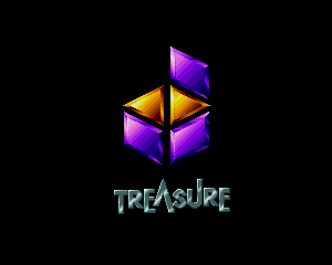
Naturally, I like Treasure’s original logo. It’s three rhombi and two triangles, all artfully arranged and even animated in many of their earlier games. It's immediately striking yet built with care, as Treasure games so often are.
Treasure changed their logo to a more generic fiery background, adding “video games” to apparently prevent confusion with companies like Treasure Financial or Treasure Beach Supplies. Understandable, but now that Treasure has seemingly receded to founder Masato Maegawa overseeing ports of a cherished older title or two, it just makes you long for the days of the purple box.
Then again, "Treasure Video Games" forms both a logo and good advice, especially when it comes to Treasure's stuff. Hold tight to that Astro Boy title for the Game Boy Advance, because at the very least it'll be worth some money.
QUEST
Here’s another developer I like: Quest, makers of the fantastic and often depressing Ogre Battle and Tactics Ogre series. Quest was the starting ground for Ogre-verse creator Yasumi Matsuno, who’d later give us Final Fantasy Tactics, Vagrant Story, and a lot of Final Fantasy XII—and who, I firmly maintain, will one day return to the big leagues and make the best video games the world has ever seen. Woe to all disbelievers.

Quest was more than just Matsuno, of course. Their older titles, Magical Chase and Conquest of the Crystal Palace among them, merit more than just a glance, and even without Matsuno’s direct oversight Quest crafted the excellent Ogre Battle 64 and Tactics Ogre: The Knight of Lodis.

Quest’s later logo is just fine, with its Q cleverly formed by three circles. Yet it's the earlier logo that catches the eye by having three Qs instead of just one. Was it just a design flourish, or do those letters stand for something? I’d guess “Queen Quote Quotient” considering Matsuno's musical tastes. The first two Ogre games are subtitled “The March of the Black Queen” and “Let Us Cling Together,” after all.
Y’SK
Want to make your game company stand out? Give it a unique logo and a very odd name. That’s what Y’sK did when founder Hozumi Yoshida got together with some other former Data East staffers around 2003. Y’sK, apparently pronounced “Wees-kay” had a short career doing programming and graphical support alongside other developers for Growlanser and Kenka Banchou titles, and the company appears not to have lasted the decade.

Y’sK had a great logo, though. A green dog in a diving pose is a bold design choice, and I really like how the animal’s ear forms part of the Y. Maybe it doesn’t make for the most typographically correct Y, but I applaud Y’sK all the same. I suppose that the only downside is a possible association with the Sega Genesis game Greendog, but no one remembers Greendog.
A number of Y’sK employees went on to work at a developer called Zex, which had a hand in some Phantasy Star and Ace Attorney games. And they have a logo that looks like a 1980s detergent brand, so I think they’re doing all right for themselves.
WOLF TEAM
Ah, Wolf Team, makers of El Viento, Arcus Odyssey, Granada, Final Zone, and loads of other games that magnificently evoked the aesthetics of late 1980s anime OVAs. They were a workhorse of a developer, and between them and their parent company Telenet they helped make the Sega Genesis and PC Engine a bastion of slick cartoon stylings and solid enough action games.
Wolf Team’s most frequently used logo doesn’t really embody that. It’s just a lightning bolt and the company name, with occasionally a CD-based voice saying “game creative staff.” Where are the hulking combat mechs? Where are the laser-spewing spaceships? Where are the plucky Peruvian heroines fighting Cthulhu spawn and hang-gliding 1920s gangsters while riding a dolphin? Man, El Viento is great.
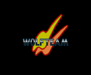
I find the earlier Wolf Team logo more notable and puzzling. It could be two thunderbolt slashes, similar to the red-and-gray symbol, but it also looks like two heavily distorted Ws or perhaps the profiles of large-crested birds. The more compact variant seen in some games even looks like a robot head similar to the rabbit-eared mechs of Patlabor. Perhaps such confusion was Wolf Team’s reason for changing it. Either way, it’s no Thinking Rabbit.
